The first version of this logo was a pickup truck.
That made sense at the time. The truck was the most visible part of the project, the thing people asked about first, the easiest thing to draw. So the earliest studies drew it: a three-quarter view, a side profile, a silhouette with a roof rack and too much detail for anything that would ever need to work at the size of a favicon.
None of those studies survive here in finished form. They were rough, they were mine, and none of them were good enough to publish. What they were, though, was honest about where the project's head was at that point.
The more time I spent on them, the more a pattern became obvious.
The more recognisable the pickup became, the more the logo ended up being about the vehicle.
Which was a problem, because the project was never supposed to be about the vehicle. Not entirely, anyway.
Nothing about the project changed at this point. What changed was realising that the truck was a tool of the experiment, not the experiment itself — the same distinction that eventually shaped The Project page far more than the logo.
A logo built entirely around the pickup would say the opposite. It would say: this is a project about a truck. Everything else — the learning, the family, the uncertainty, the three years of preparation — would sit outside the frame, permanently secondary to the one object easiest to draw.
So the vehicle started coming out of the sketches, one version at a time. Less roof rack. Less detail. Less truck.
At one point what remained was barely recognisable as a vehicle at all — a few lines that could have been a pickup, or could have been nothing in particular. That felt closer, but it wasn't the answer either. It was just the absence of the wrong answer.
Eventually there was nothing left of it to draw.
Somewhere in that empty space, an old memory came back uninvited.
My father had a UAZ. I remember it the way children remember things: not accurately, probably, but vividly — the sound of it, the smell of it, the sense that it belonged to a slightly different, harder, more capable world than the one I lived in day to day.
That was also the decade I first read about Reinhold Messner, Jerzy Kukuczka, Mike Horn — no, before Horn, it was Fogar and Walter Bonatti whose names I actually grew up with — men whose expeditions felt less like sport and more like a different relationship with the planet altogether. I didn't understand most of what they were actually doing. I understood that it looked serious, and slightly out of reach, and that I liked the feeling of it.
None of this is a claim about the 1980s as a decade. It's a claim about what the 1980s felt like from inside a child's memory of one specific garage. That distinction matters, because it's easy to turn a personal memory into a costume — an "Eighties logo", complete with the visual clichés that phrase usually implies. That was never the intention.
We didn't want to make an Eighties logo. We wanted to preserve something of the way those years felt.
Nothing literal came out of this stage. No UAZ silhouette, no expedition-poster aesthetic. What it left behind was a tone: sturdy, a little worn, unimpressed by its own seriousness. That tone stayed in the room for everything that came after.
The next reference point moved forward about twenty years and sideways into typography.
Early twentieth-century graphic design — roughly the Belle Époque and the years immediately after, French and Italian lettering and layout in particular — sits chronologically very close to the 1907 Peking–Paris race that The Project already borrows its route from. It wasn't studied as decoration. It was studied because it solved a specific problem well: letters that could function as image, not just as text sitting on top of one.
Nothing from that period was copied directly. The point was never to reproduce a specific poster or typeface. It was to understand a general idea worth stealing: that a name, built and spaced correctly, doesn't need an illustration next to it to carry weight. It can carry its own.
At this stage there was still no circle, and nothing East Asian had entered the picture yet. This was purely about how the letters of the name would eventually sit together.
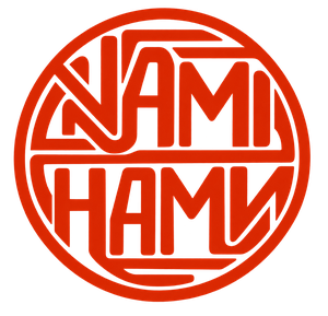
The Current Mark
The circular form came from somewhere else.
It isn't European lettering, and it isn't a wheel or a compass, whatever a first glance might suggest. The reference is older and further east: the round seals historically used across East Asia to mark documents, artworks and identity — a form that carries authority and completion in a single unbroken line.
That fit the project on two levels at once. Literally, it points toward the direction of the journey and Beijing as its destination. Less literally, it gave the name somewhere to live that wasn't a rectangle borrowed from a hundred other logos.
The lettering carries the memory of early-twentieth-century Europe. The circle carries the memory of somewhere considerably further east. They were never meant to blend into a single reference. They were meant to sit next to each other, doing two different jobs.
NAMI
НАМИ
Inside the circle, the name is written twice: once in the Latin alphabet, once in Cyrillic.
The practical reason came first. A name that reads clearly in more than one script travels better, plainly and literally, across a route that doesn't stay inside a single alphabet for very long.
The second reason is less practical and matters more to me. Cyrillic represents a real and significant part of the geographic and linguistic space the route actually crosses — not the whole of it, and not every population along the way, but an honest and considerable share of it. Writing the name twice felt like a small, precise acknowledgement of that, rather than a decorative flourish borrowed from a country the truck may or may not ever pass through.
It isn't a claim that everyone between Paris and Beijing reads Cyrillic. It's a claim that a meaningful part of that distance does, and that the mark should say so plainly instead of pretending the journey happens in one language.
Today the logo contains no separate symbol to decipher. It is a composition of letters contained within a simple form.
It does not tell the whole story, and it isn't supposed to.